AI Patterns
Overview
In OneDesign, we define four foundational AI layout patterns that, together with AI components, ensure consistent interactions and seamless integration across all touchpoints and user journeys.
These patterns are not rigid templates. They are flexible and should adapt based on:
- The purpose of the feature
- The user's journey
- The device or context the user is in
Patterns may transition dynamically — for example, moving from an Assistive panel to an Immersive workspace — to best support the user's goals.
- Responsiveness and accessibility must always be considered.
AI Patterns
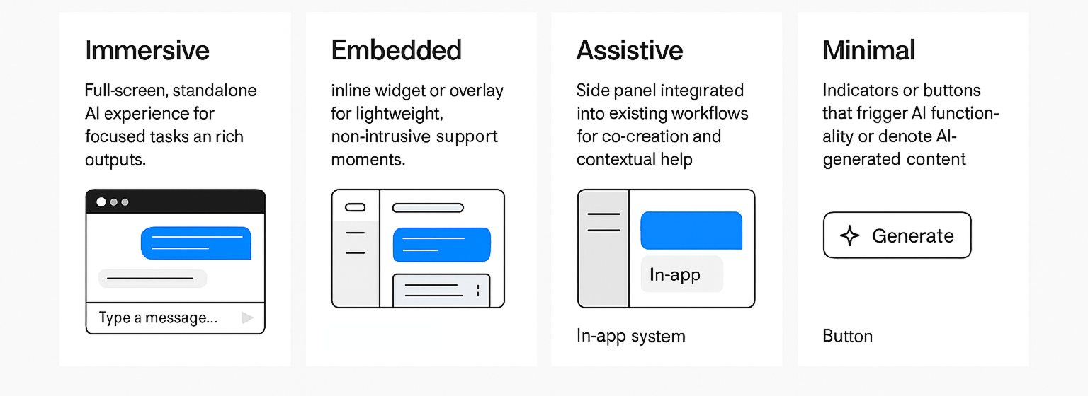
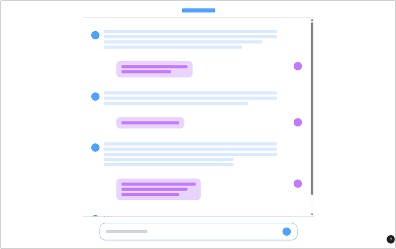
01 - Immersive
Definition: Full-screen, standalone AI experience for focused tasks and rich outputs.
When to use
- When AI is the primary task (e.g., Copilot workspace)
- For complex workflows requiring deep focus and visualization
Do's
- Provide session tools (history, export, sources)
- Use clear backgrounds and maintain focus
Don'ts
- Overload with unnecessary UI elements
- Hide critical controls
02 - Embedded
Definition: Inline widget or overlay seamlessly integrated into a workflow for lightweight, asynchronous support.
When to use
- For quick hints, summarization, or task-limited interactions
- Reactive or proactive prompts (with consent)
Do's
- Keep it unobtrusive and easy to dismiss
- Respect screen real estate
Don'ts
- Use for heavy reasoning or creative co-workflows
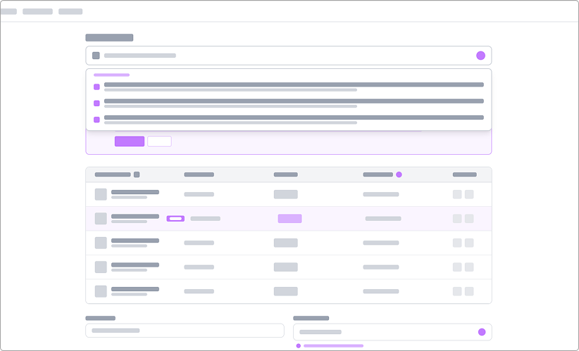
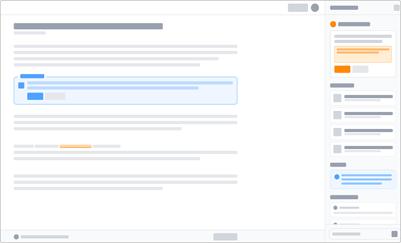
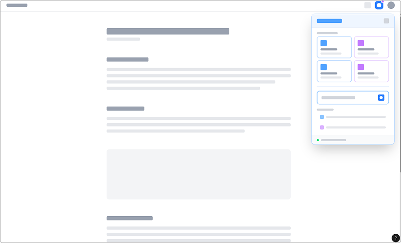
03 - Assistive
Definition: Side panel integrated into an existing workflow, offering contextual help and co-creation without disrupting the main task.
When to use
- When users need AI assistance while staying in context
- For summarization, code generation, or quick edits
Do's
- Keep panel resizable and non-intrusive
- Offer quick actions (insert, replace, comment)
Don'ts
- Block primary content
- Force users to switch context unnecessarily
04 - Minimal
Definition: Indicators or buttons that trigger AI functionality or denote AI-generated content.
When to use
- For simple AI actions (e.g., "Ask AI" button)
- To show AI-generated status without clutter
Do's
- Use clear labels and icons (sparkle icon)
- Keep colors neutral to avoid overwhelming users
Don'ts
- Overuse badges or icons